Often times we live our lives in a myopic world; thinking the world revolves around the way we see it. For example “Homeland” is a great show, because I love it and all of my friends love it too (for the record Homeland is a great TV show (smile)). Even a show as popular as “Seinfeld”, no matter how many people actually liked the show, there are more people in the world who didn’t watch it then did. According to a Newsweek poll 29% of Americans don’t even know who the Vice-President is. My point is we often get lost in our own view of the world and we forget that the rest of the world may not see things the same way that we do. This same philosophy holds true for viewing the internet as well. The way we browse the internet isn’t the same as everyone else!
We choose our web browsers the same way we choose our food. Some of us care only about the looks or taste, while others of us want to know if it’s good for us or not. Many people pick their browser simply because it came with their computer and never realized they had other options. However you chose your web browser; it’s important to remember that there are other browsers beside your own in this vast world of the internet, and different browsers give different viewing experiences.
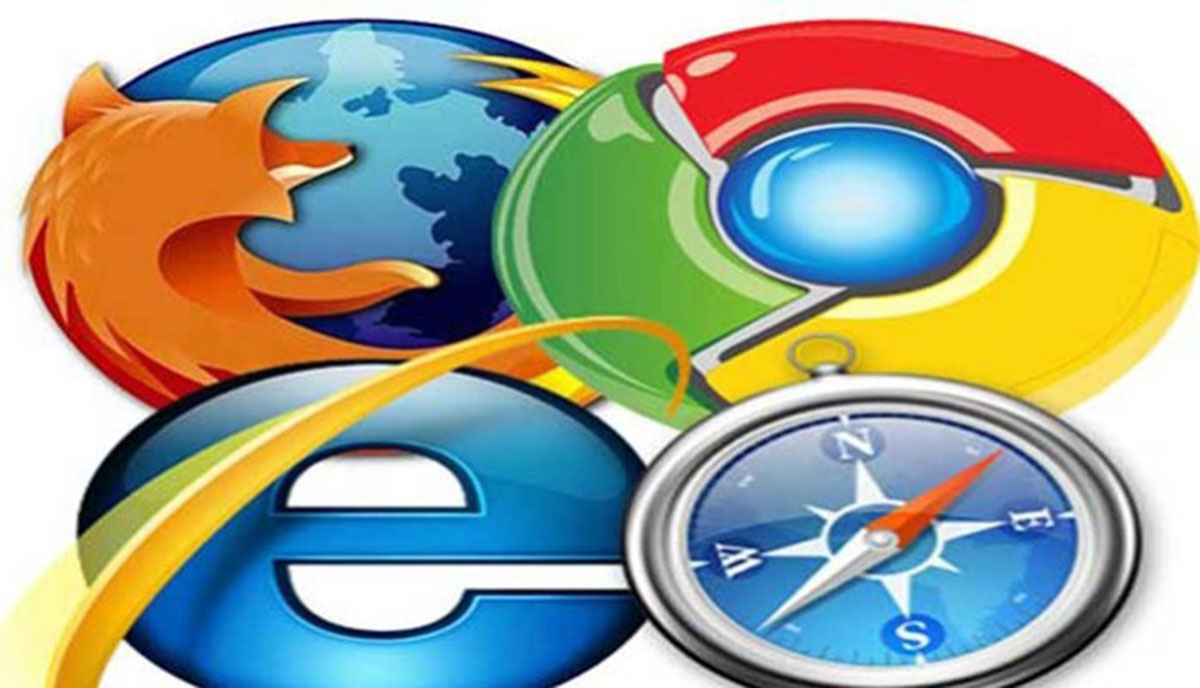
Let’s take a simple test. I’m going to mention eleven different words and I want you to guess if you know what they are? Ready…here we go. Stainless, Maxthon, Sleipnir, Swiftfox, Lunascape, Konqueror, SeaMonkey, OmniWeb, Camino, Vivaldi, and Flock. Okay times up; if you guessed that they’re all different web browsers…you get a gold star! These may be minor web browsers yet people use them none the less. Now we get to the major browsers that many people have heard of including; Firefox, Chrome, Opera, Safari, and the infamous Internet Explorer (IE). The major browsers with the exception of IE will nag you to update the browser whenever a new version becomes available. Safari of course hasn’t supported Windows for several years now. IE does automatic updates, unfortunately the updates are tied to the operating system. Many people don’t want their Windows OS updated; therefore no automatic updates to the browser. Automatic updates are good because people who use Firefox, Chrome, Opera, and Safari almost always are using the latest and greatest version of that particular browser. Even using the latest browser doesn’t guarantee an exact user experience between the different browsers. Each browser has an unique layout engine or rendering engine. The layout engine is the code that tells the browser what to do with the code (HTML, CSS, JavaScript, PHP, etc.) that it’s given. Each layout engine interprets the code slightly different. This is why sometimes the difference in website design between different browsers may be slight or it may be radically different. WebKit, Blink, Gecko, Trident, and EdgeHTML are just five of many layout engines in existence on the web today. All browsers are not created equal and the browser you use determines what you’re able to see.
Another issue to remember is two people can view the same website using the same identical browser and still receive a different experience. This is because the Operating Systems (OS) handle fonts differently. The way typefaces are displayed it is most often handled by the OS and not the browser.
Two people can use the same browser and still have a different viewing experience. The reason for this is because not everyone is using the same viewport device. In other words one person may view the web on their desktop computer while someone else may view from their mobile phone. The vast majority of the digital population (78 percent) is multi-platform and goes online using both desktop and mobile platforms according to the comScore Media Metrix March, 2015 report. Apple iPad Air, iPad Mini, Amazon Kindle Fire, Samsung Galaxy, Microsoft Surface Pro 2, and Barnes & Noble Nook HD+ are just a few of the many different computer tablets available today; each tablet gives a different viewing experience to the user. Apple iPhone 5 , The Samsung Galaxy, LG Optimus G, HTC One, Google Nexus 5, and Moto X are just a few of the many different smart phones on the market today; each smart phone also gives a different viewing experience to the user. So we can now see it is important when designing websites to keep in mind not only the users’ browser of choice but his viewport device of choice as well.
“Measure twice cut once.”
With so many different browsers, various browser versions, and different viewport devices; how can anyone ensure a pleasurable viewing experience for all users? This is where cross browser testing comes into play. In today’s modern web world it is imperative when designing websites to test as much as possible to make sure the design works in as many different browsers and viewports as possible. Make sure your web designer of choice does this, otherwise your audience may never see what you see and that would be money wasted! I test my designs to work with all the major browsers above. In addition my designs are responsive so they work in most tablets and smart phones.
In summary your web design may be the best design on planet Earth, however without cross browser testing you may be the only person to see it! Don’t throw away your hard earned money. If your web designer of choice isn’t doing cross browser testing it may be time to find a new web designer!


