Portfolio One
A Glimpse into the Mind of a WordPress Webmaster

Project Role: WordPress Webmaster
Is It Just Us
Who They Are?
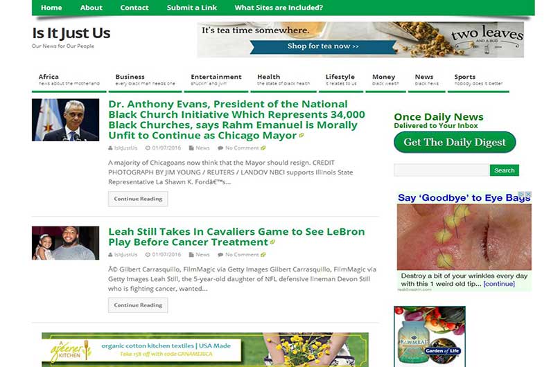
Is It Just Us is a News Aggregator Website targeting the Black Experience. The site is designed to bring in various news articles from across the internet, relating to the Black community, into one central location.
This is a website using the Wordpress content management system (CMS). I used the Mesocolumn Theme by Dezzain. I used different shades of green as my color palette for this website. To pull in the various news feeds from across the internet and to make sure the link goes back to the original article, rather than a page on my website, I used the plugin AutoBlog by WPMU DEV. To get the links to open in a new window on the browser I used the plugin WP External Links. My method was different; however I would like to give credit to Andrea Whitmer over at http://nutsandboltsmedia.com for the inspiration for this website.
I also made an effort to keep the number of plugins low to keep the website performance up. I am using unmanaged hosting thru RamNode. I’m using an Nginx in front of Apache App Stack thru ServerPilot; and I monitor the server’s performance thru NodeQuery. In addition I am using CloudFlare as a CDN (content delivery network) and a DNS (domain name system) for faster performance globally.
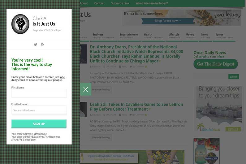
Get the Daily Digest
In a text widget I made a ‘Get the Daily Digest’ button using a CSS button generator which when clicked links to a form made using the plugins; Ninja Kick: Contact Form and MailChimp for Wordpress. The cool thing about this is it pushes content away while revealing the contact form. This particular form has all subscribers go through a double opt-in process, which conforms to anti-spam laws. Once subscribed individuals receive one daily email listing the latest news for the day. I also included icon links to twitter and a website RSS feed.
Get the Latest News on Twitter
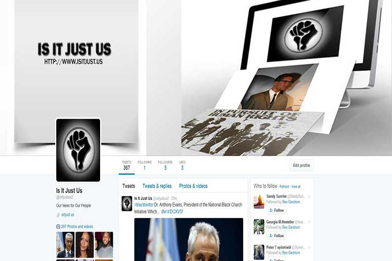
For all those that love social media; I made a twitter account where you can get the latest news tweeted on your timeline. I used a free service called Deliver It http://dlvr.it, which takes the RSS feed from this website and tweets the title along with a shorten link to the original article. I was also able to include a hashtag at the beginning of every tweet to make it easier for those interested in the tweets to find them.
The twitter header image consists of two separate images combined. The image on the left consists of; the title of the website in large font using a bevel and emboss effect, along with a drop shadow. The website URL is a smaller font size positioned above the logo. The image on the right is a modified Photoshop template which gives the appearance of two images, one resting on the other resting on a computer monitor, which is showing a third image. Then I combined the two images side by side into one larger image and together it became the twitter header image.
Screenshots


Back to Portfolio